-
Nike NBA Reverse Engineer Post
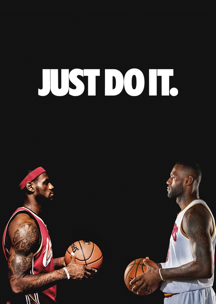
The alignment of the words is placed directly in the middle of the Ad for the audiences’ eyes to gaze upon it first. It is put in a white color font to contrast the black background in order for the words to stand out. The typography being using is the font is Trade Gothic condensed.
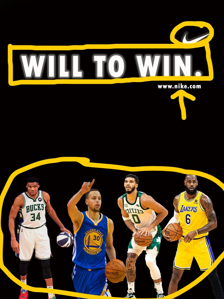
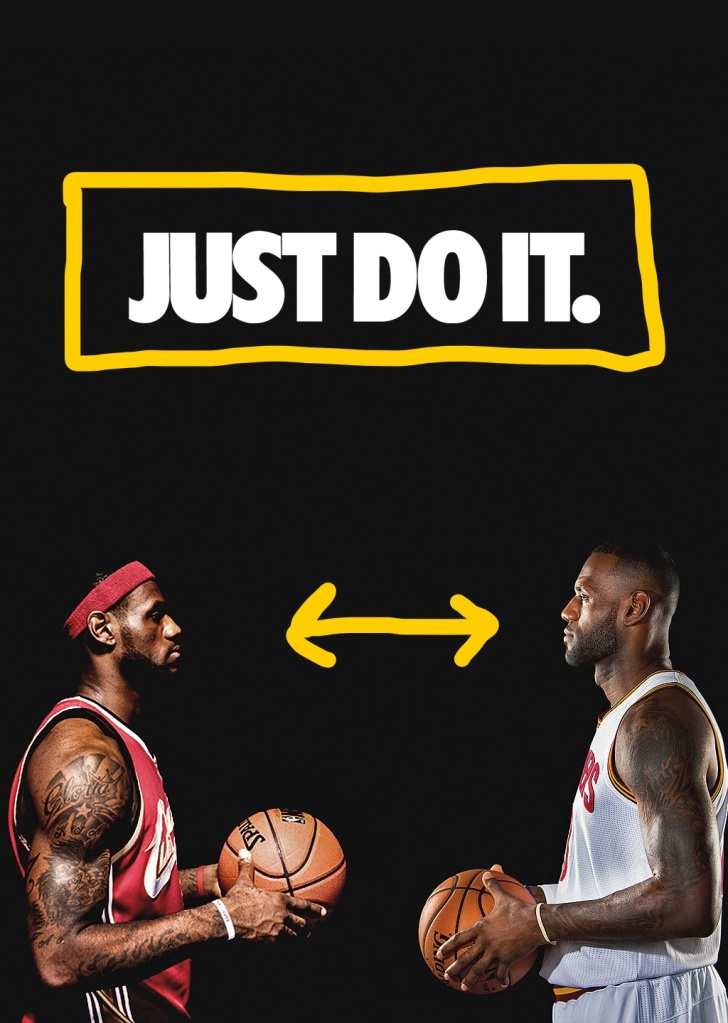
In my Ad I tried to keep the similarity of the original Ad when making this. I applied the white font to contrast the black background. I also included not two but four players in my Ad to reflect the original Ad but with a twist. The typography I used was called Tw Cen MT condensed bold. which is similar to the original typography.
The reason why my Ad works well with the original is because they still have the same aesthetic going for both of them. They are almost the same but with different images, fonts and logos. They match perfectly together while being completely different individually.
-
Type & Photography
By: Andrea Gonzalez
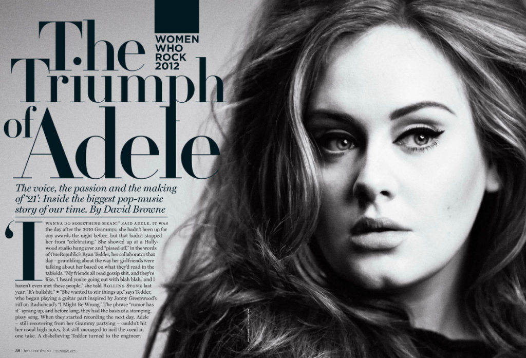
Adele is an English singer and songwriter. She is one of the best-selling artist of a generation and cover girl. The ‘Someone Like you’ singer nabbed the cover of Rolling Stone’s ‘Women Who Rock 2012’ issue written by David Browne.
Category Identification
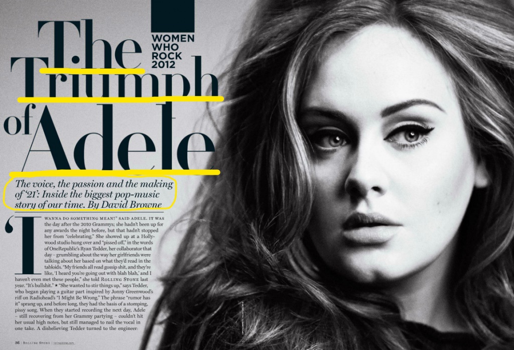
The headline of this article is ‘The Triumph of Adele’. It is written in Serif which makes it a more formal piece of writing/work. Below the headline is a small description of who Adele is by David Browne written in Monotype Scotch Roman Italic.
Contrasting Typeface
In the headline format written in Serif, we can see the letter e is at an upright position with the edges being bolded more than the center line and tail. If you look below in the description box written in the format Monotype Scotch Roman Italic, you can see the letter e is angled upwards and is more rounded towards the center to almost a shape of an oval rather than a crisp half circle.
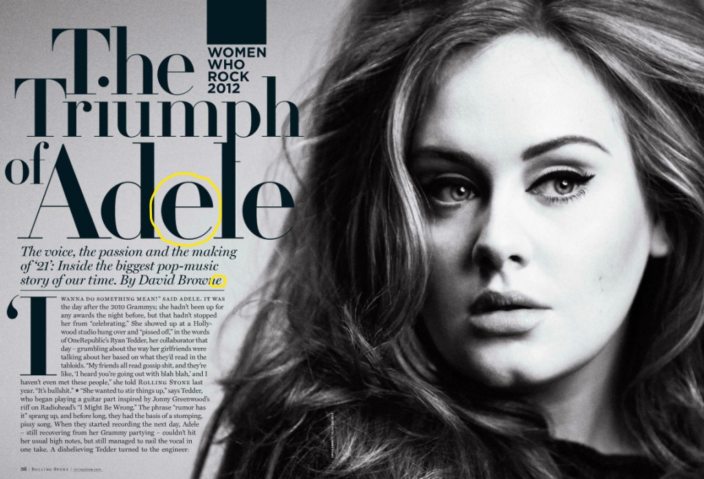
Depth of Field
The photographer used depth of field in this image by making a specific space be relatively sharper and more focus than the rest. In this instance the part that is sharper and focus would be Adele’s facial features instead of the rest of her head.


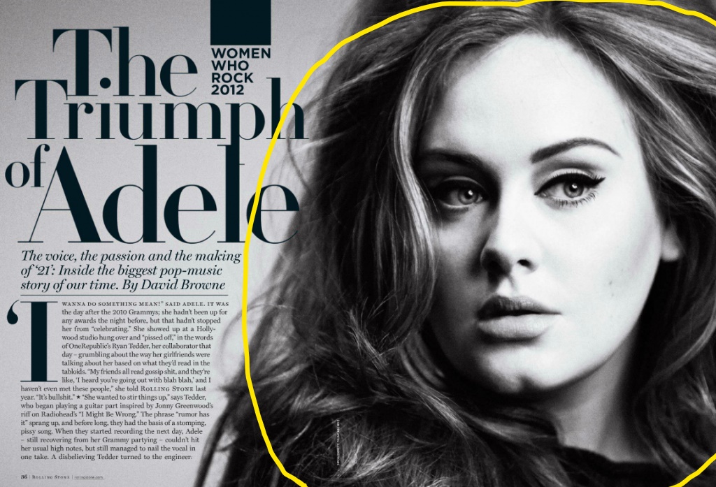
The above photos would still work if swapped with the original because all three have that black and white contrast. Another reason would be that all three images show that depth of field by having one area more sharpened and focus than the rest.
Conclusion
All of the above principles contribute to the overall design by reeling in the viewers focus towards the sharp areas of the image and blurring out the rest around it. The type of fonts use help direct the eyes to the big, bold lettering. of the headline and guide your way down as the fonts get smaller and change design.
-
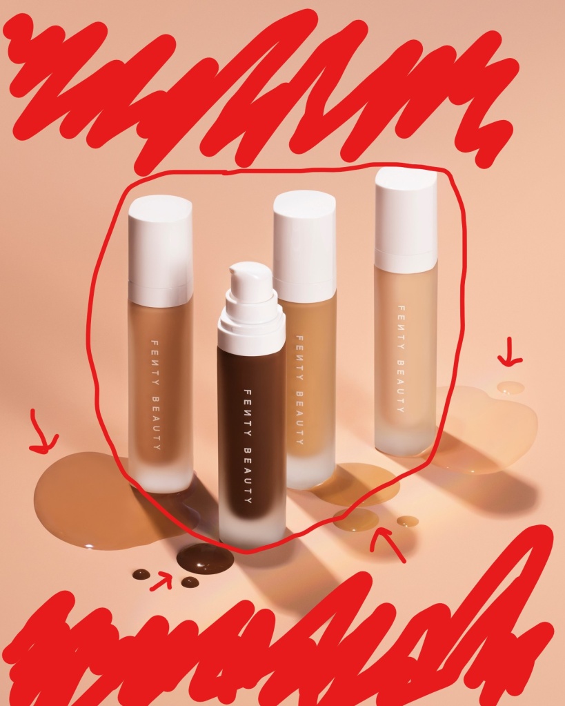
Fenty Beauty
By: Rihanna

https://www.instagram.com/p/CmXZKVNuBrP/ The image above that will be analyzed is from a Fenty Beauty ad about the new collection of foundation colors. I found this ad on Instagram through the Fenty Beauty account open to the public. Up above is a link to the account with this Ad posted on their page.
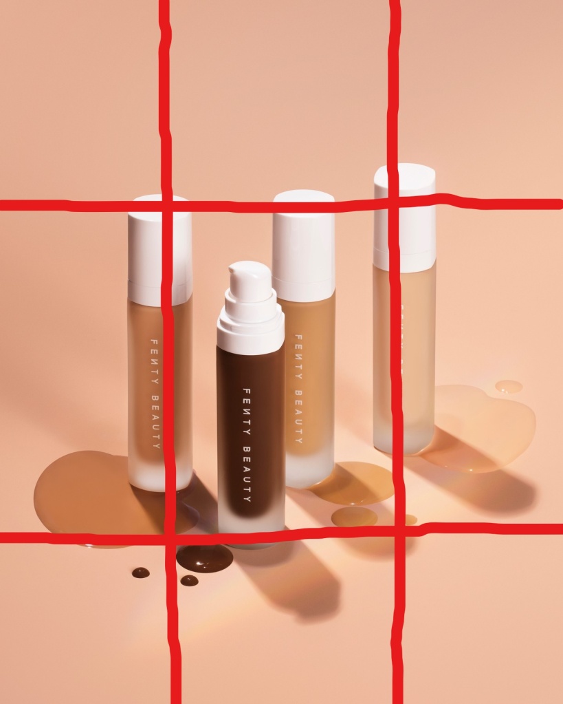
Contrast
The background of this image is supposed to represent a skin-like color. The reason being is to distinguish the variety of colors that the Fenty Beauty brand represents and has to offer to buyers all around the world. Another contrast is the product itself being put side to side with a few of the foundation shades they have to show.
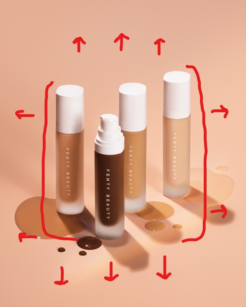
Proximity
On this Ad we see that the product being sold is concentrated front and center so that your eyes direct to that middle point of the image. Leaving the rest of the space blank. This creates a relationship between the blank space and the product to understand what is being sold.
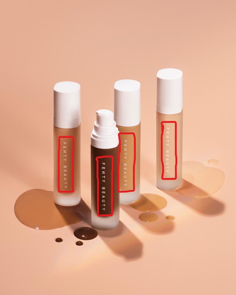
Repetition
The most obvious form of repetition would be the brand name repeated on each of the bottles for the audience to see. It’s written with the same font and same size on each bottle. It is a quick and simple read as it’s place right in the center of this Ad.
Alignment
On the Ad the image with the text on the bottle is found concentrated mainly in the center leaving the sides, top and bottom of the page blank so that your redirected to the spot with the product in the middle.
Color
This foundation ad is all about color. Rihanna wanted to show some of the different shades she has to offer, and this Ad represents light, medium and dark shades.
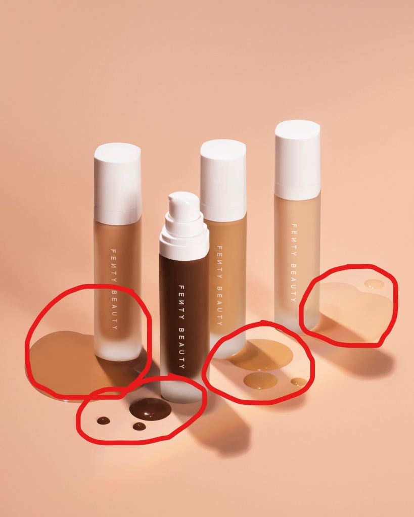
This brand by Rihanna demonstrates the principles of design (contrast, repetition, alignment, proximity and color). This Ad gives the audience a clear and understandable message of the product being sold. Fenty Beauty made a direct message with this Ad by showing off the product front and center with options of color shades.
-
Hello World!
Welcome to WordPress! This is your first post. Edit or delete it to take the first step in your blogging journey.

-
Subscribe
Subscribed
Already have a WordPress.com account? Log in now.
