By: Rihanna

The image above that will be analyzed is from a Fenty Beauty ad about the new collection of foundation colors. I found this ad on Instagram through the Fenty Beauty account open to the public. Up above is a link to the account with this Ad posted on their page.
Contrast
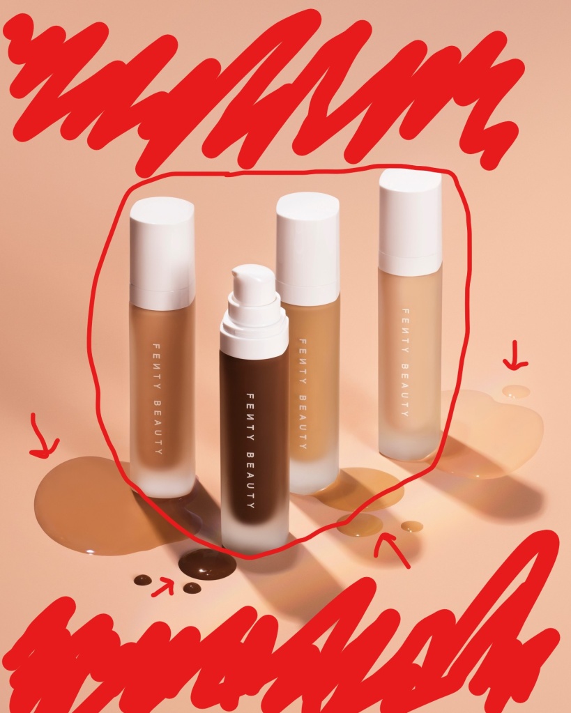
The background of this image is supposed to represent a skin-like color. The reason being is to distinguish the variety of colors that the Fenty Beauty brand represents and has to offer to buyers all around the world. Another contrast is the product itself being put side to side with a few of the foundation shades they have to show.
Proximity
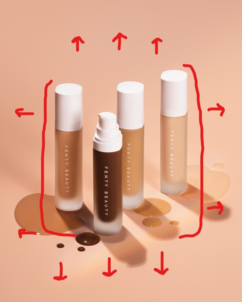
On this Ad we see that the product being sold is concentrated front and center so that your eyes direct to that middle point of the image. Leaving the rest of the space blank. This creates a relationship between the blank space and the product to understand what is being sold.
Repetition
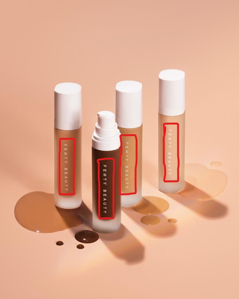
The most obvious form of repetition would be the brand name repeated on each of the bottles for the audience to see. It’s written with the same font and same size on each bottle. It is a quick and simple read as it’s place right in the center of this Ad.
Alignment
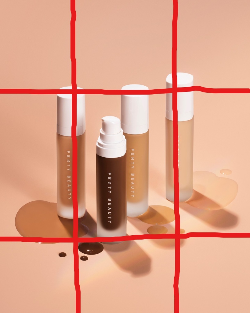
On the Ad the image with the text on the bottle is found concentrated mainly in the center leaving the sides, top and bottom of the page blank so that your redirected to the spot with the product in the middle.
Color
This foundation ad is all about color. Rihanna wanted to show some of the different shades she has to offer, and this Ad represents light, medium and dark shades.
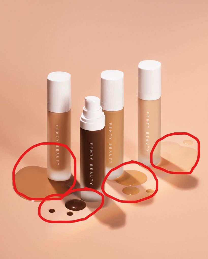
This brand by Rihanna demonstrates the principles of design (contrast, repetition, alignment, proximity and color). This Ad gives the audience a clear and understandable message of the product being sold. Fenty Beauty made a direct message with this Ad by showing off the product front and center with options of color shades.

Leave a comment