By: Andrea Gonzalez
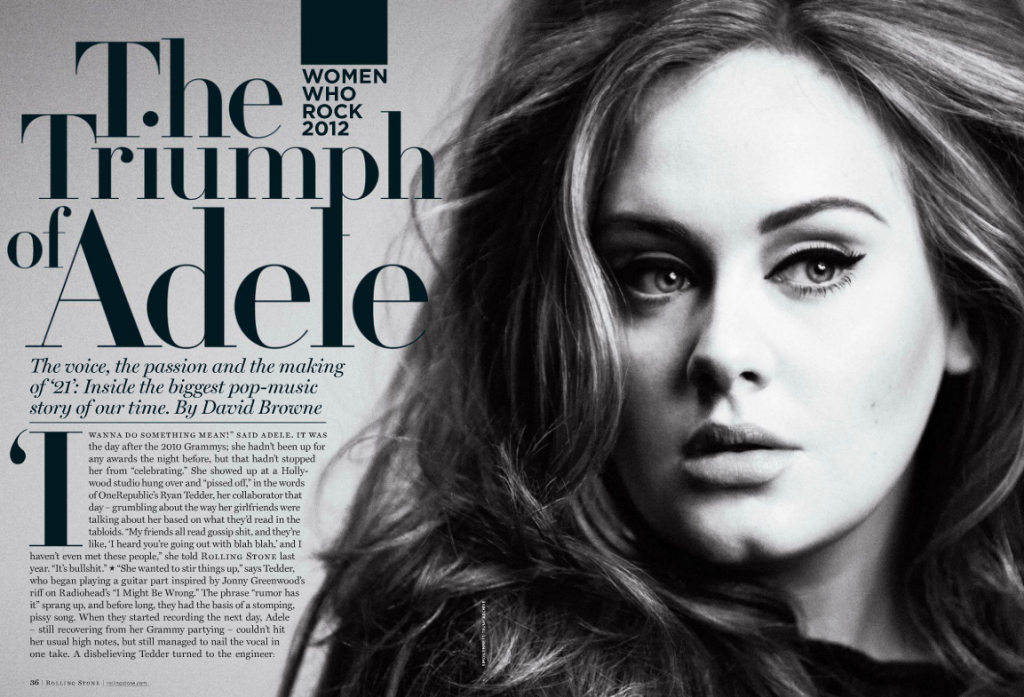
Adele is an English singer and songwriter. She is one of the best-selling artist of a generation and cover girl. The ‘Someone Like you’ singer nabbed the cover of Rolling Stone’s ‘Women Who Rock 2012’ issue written by David Browne.
Category Identification
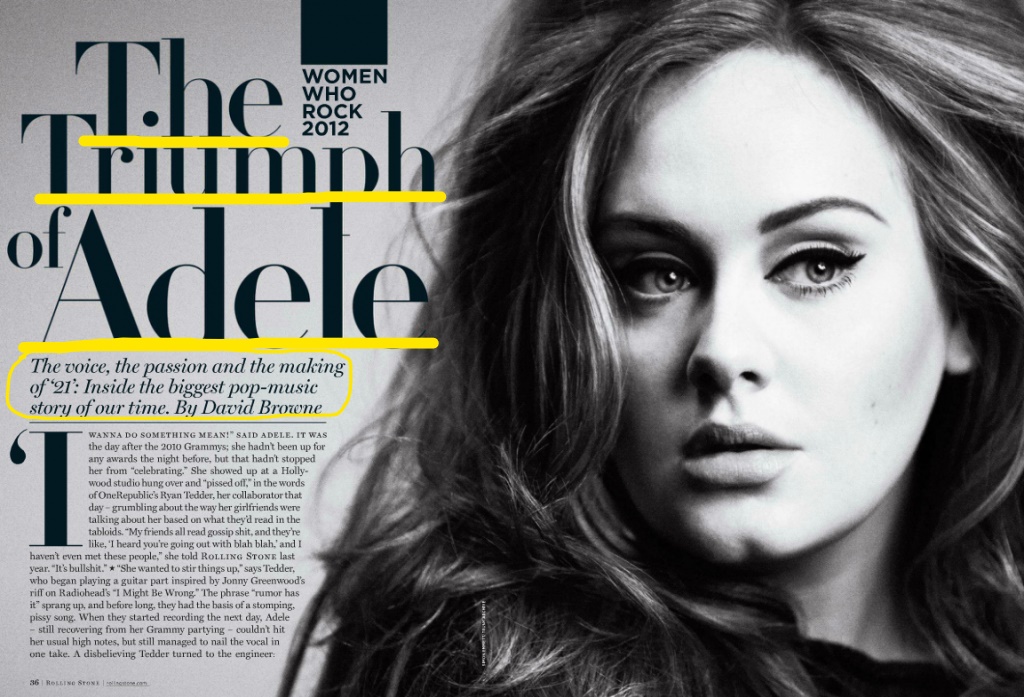
The headline of this article is ‘The Triumph of Adele’. It is written in Serif which makes it a more formal piece of writing/work. Below the headline is a small description of who Adele is by David Browne written in Monotype Scotch Roman Italic.
Contrasting Typeface
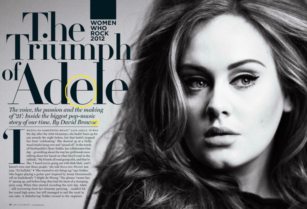
In the headline format written in Serif, we can see the letter e is at an upright position with the edges being bolded more than the center line and tail. If you look below in the description box written in the format Monotype Scotch Roman Italic, you can see the letter e is angled upwards and is more rounded towards the center to almost a shape of an oval rather than a crisp half circle.
Depth of Field
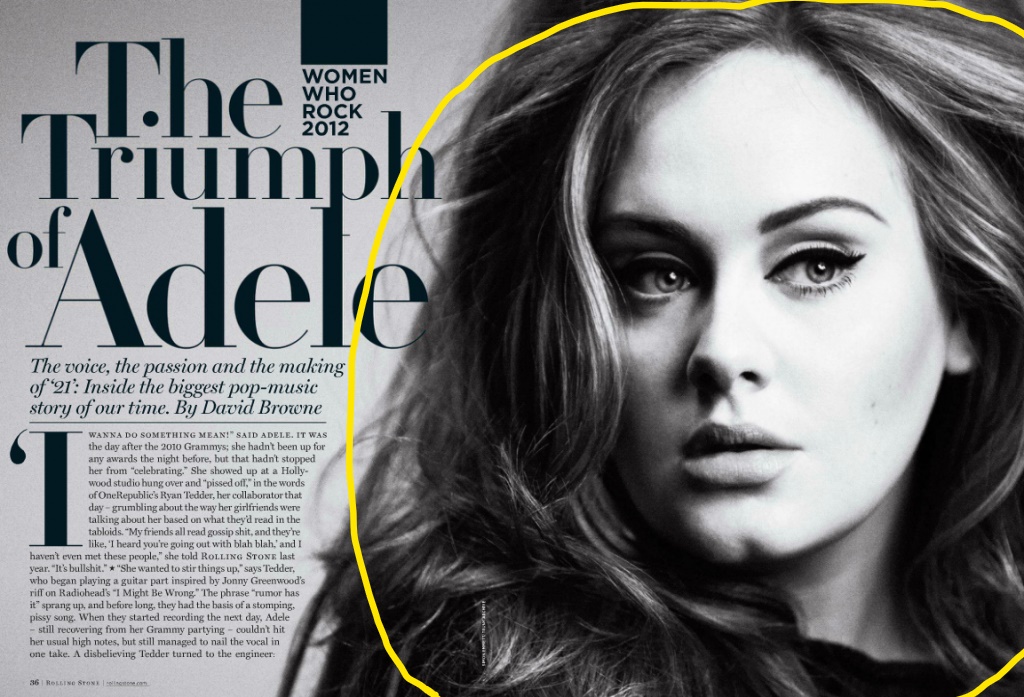
The photographer used depth of field in this image by making a specific space be relatively sharper and more focus than the rest. In this instance the part that is sharper and focus would be Adele’s facial features instead of the rest of her head.


The above photos would still work if swapped with the original because all three have that black and white contrast. Another reason would be that all three images show that depth of field by having one area more sharpened and focus than the rest.
Conclusion
All of the above principles contribute to the overall design by reeling in the viewers focus towards the sharp areas of the image and blurring out the rest around it. The type of fonts use help direct the eyes to the big, bold lettering. of the headline and guide your way down as the fonts get smaller and change design.

Leave a comment