
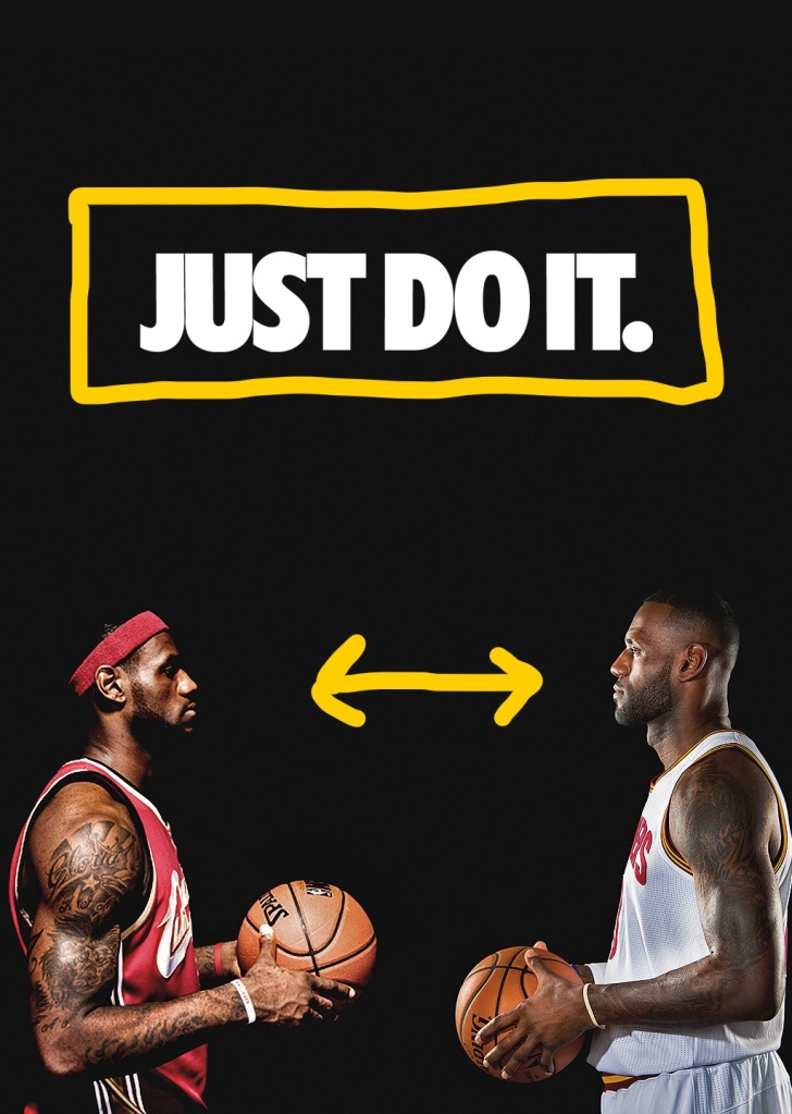
The alignment of the words is placed directly in the middle of the Ad for the audiences’ eyes to gaze upon it first. It is put in a white color font to contrast the black background in order for the words to stand out. The typography being using is the font is Trade Gothic condensed.
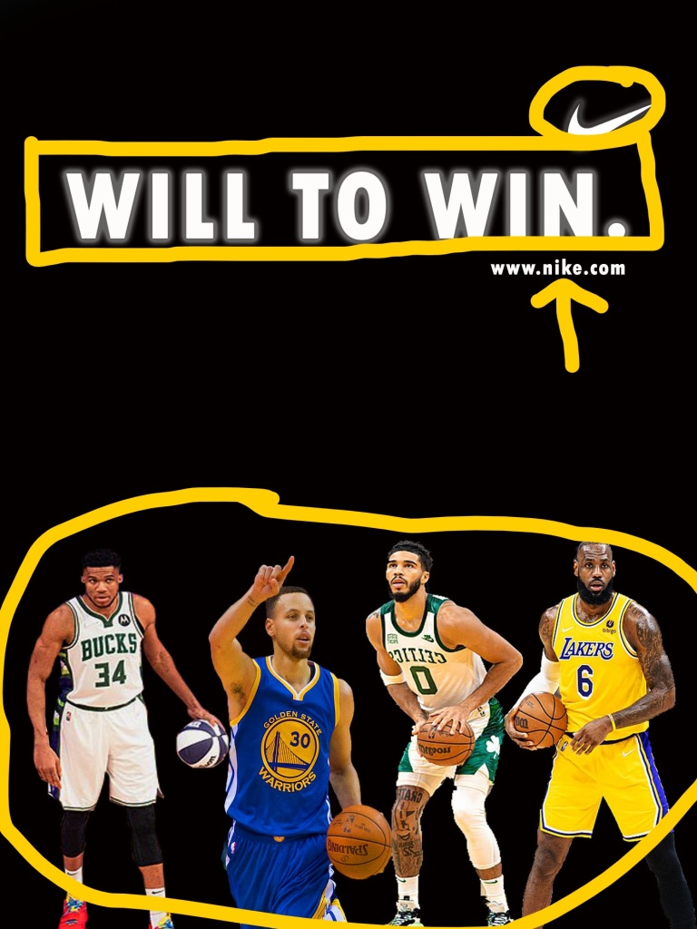
In my Ad I tried to keep the similarity of the original Ad when making this. I applied the white font to contrast the black background. I also included not two but four players in my Ad to reflect the original Ad but with a twist. The typography I used was called Tw Cen MT condensed bold. which is similar to the original typography.
The reason why my Ad works well with the original is because they still have the same aesthetic going for both of them. They are almost the same but with different images, fonts and logos. They match perfectly together while being completely different individually.

Leave a comment